Build with AI · Skills I built · 4 min read
One file that teaches Claude how I design.
Every redesign goes through the same stages, and I used to explain them from scratch each time. Now they live in one file. Claude opens it when a brief matches, works in that order, and shows each stage before moving on.
- Runs in
- Claude Code
- Kicks in on
- Redesign and explore briefs
- Written
- After the CAMP redesign
- The rule
- AI drafts, never decides
What a skill is
Redesign these four screens
Starting with stage 1. I’ll rebuild one screen and show it before touching the rest.
---
name: design-process
description: From screenshots to a
  tested redesign. Use when a brief
  says redesign, explore or compare.
---
- 1Capture what exists
- 2Name the problems
- 3Research references
- 4Explore wide
- 5Decide narrow
- 6Test
- 7Animate in Figma
- 8Turn it into a case study
A skill is a folder with one Markdown file. The top of the file says what it is for, in a line or two. Claude reads that line with every brief, and opens the rest only when the brief matches. The rest is plain English: what to do, in what order, and what never to do.
The eight stages
- 01
Capture what exists
Start from the real screens: the App Store, the live product or the Figma file. Rebuild one, show it, then do the rest. The rebuild is working material and stays out of the case study.
- 02
Name the problems
Three to five, each as a short title and one plain sentence on why it hurts. Contrast and accessibility checks on the originals turn them into measured facts.
- 03
Research references
About twenty screens from strong products doing the same task. Borrow the pattern several of them share, not the pixels. The references stay private.
- 04
Explore wide
Several options for each problem, labelled A to F, beside the screen they change: in HTML to react to quickly, and in Figma to build on. Each round ends with a suggested combination, built as a whole screen.
- 05
Decide narrow
I pick, and the pick gets built properly: the brand as variables, repeated parts as components, one clear action per screen.
- 06
Test
Contrast again, empty and edge states, and one task walked end to end. Then a synthetic check: AI personas try the old and new screens blind, on the same tasks. It is labelled synthetic and comes before real users, never instead of them. The notes stay next to the screens, so each version shows what changed and why.
- ↻
Then round again
Stages 2 to 6 repeat. Each round starts from the last test, not from scratch, and keeps the earlier versions beside the new one. It stops when no problem comes up twice, when two rounds in a row find only small fixes, or after three rounds. Then the design goes to real people.
- 07
Animate in Figma
Motion is added in Figma with keyframes, so a transition can be shown as it would feel in the app.
- 08
Turn it into a case study
Only when asked. The product problem comes first and AI is the method. Pictures move, numbers mean something to a reader, and nothing goes up that isn’t public.
What it never does
Pick the winner
It suggests a combination and builds it, so I can judge a whole screen. The choice is still mine.
Run ahead
One screen comes back first. Every stage is shown before the next begins.
Publish references
Screens from other products are working material. They never go on the portfolio.
Write the story on its own
A case study starts only when I ask, and uses public information only.
Start from scratch twice
A second round starts from the last test results. Tested versions are never overwritten.
Pass off personas as people
Synthetic test results are labelled synthetic everywhere and never stand in for real users.
Examples
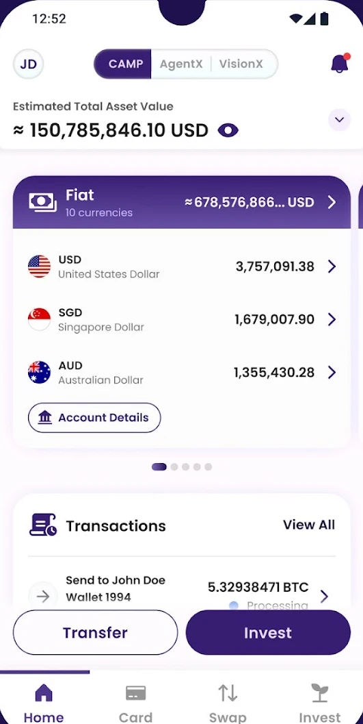
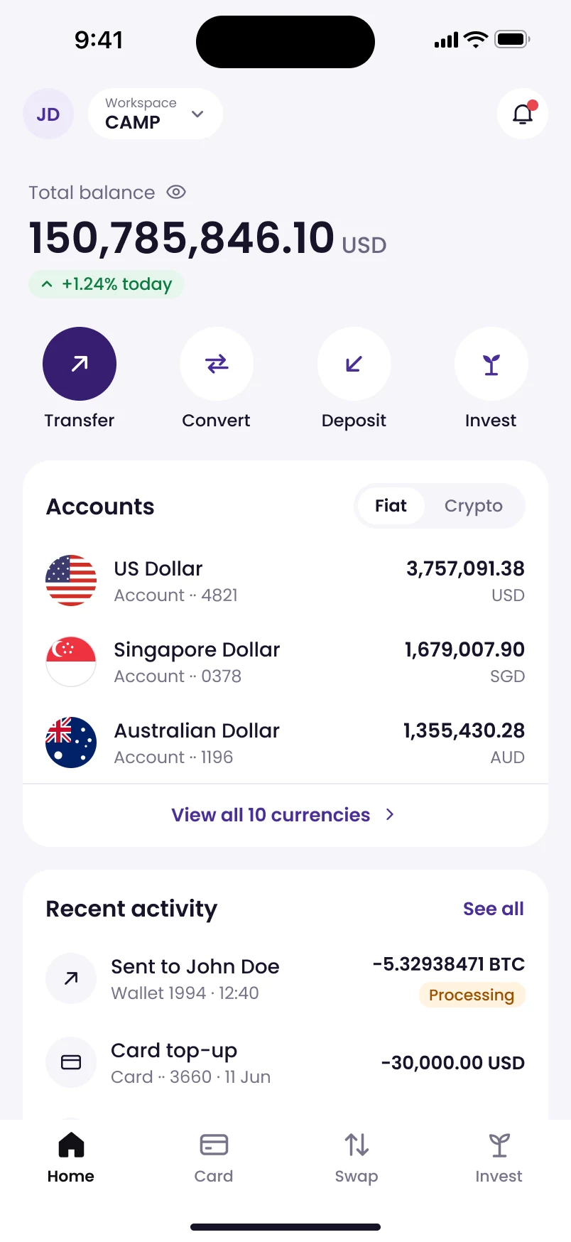 A
A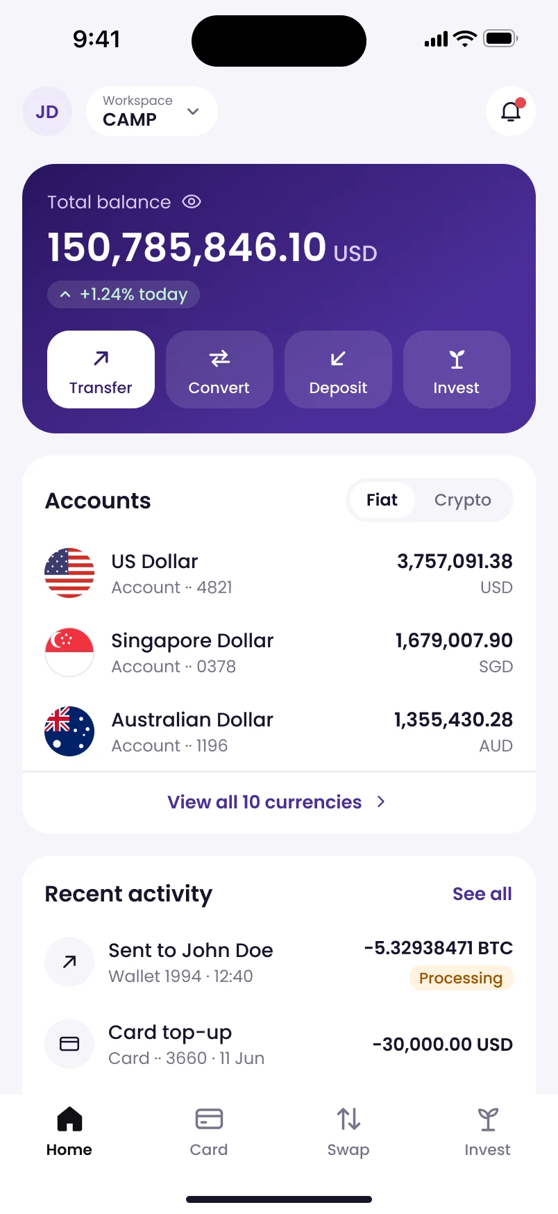 B
B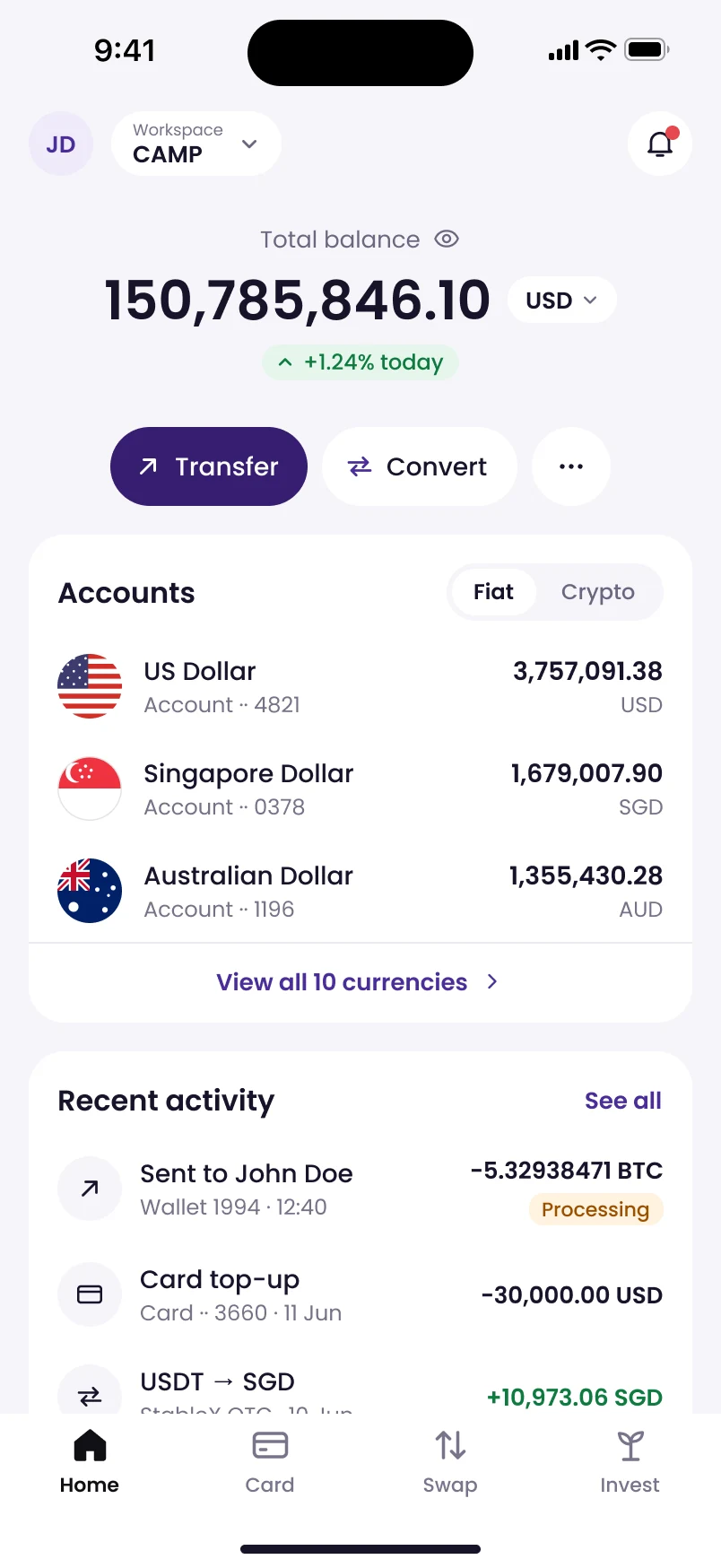 C
C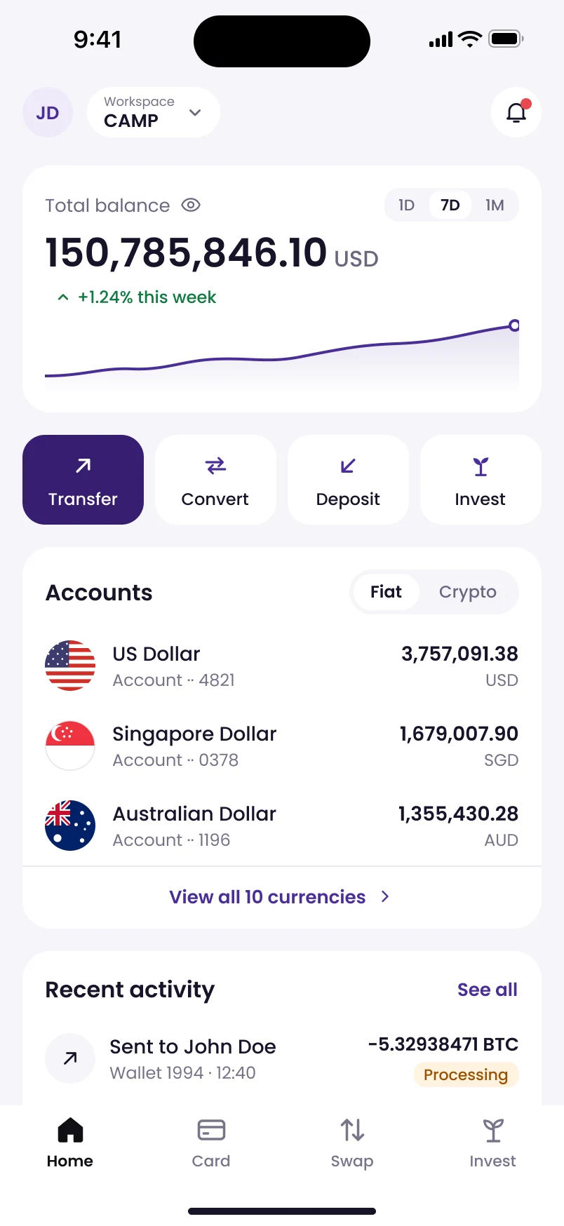 D
D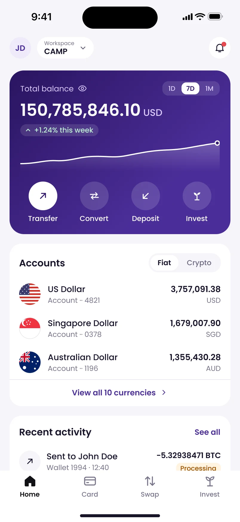
Treasury app · all eight stages · 2026
MetaComp CAMP
The brief was “Redesign these five screens”. One screen came back first, then options for each problem, a tested pick and a case study, in 72 minutes.
20 references · 27 options · 4 → 0 faint text colours
 A
A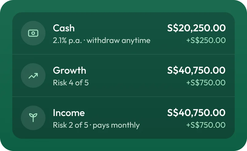 B
B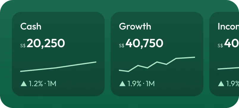 C
C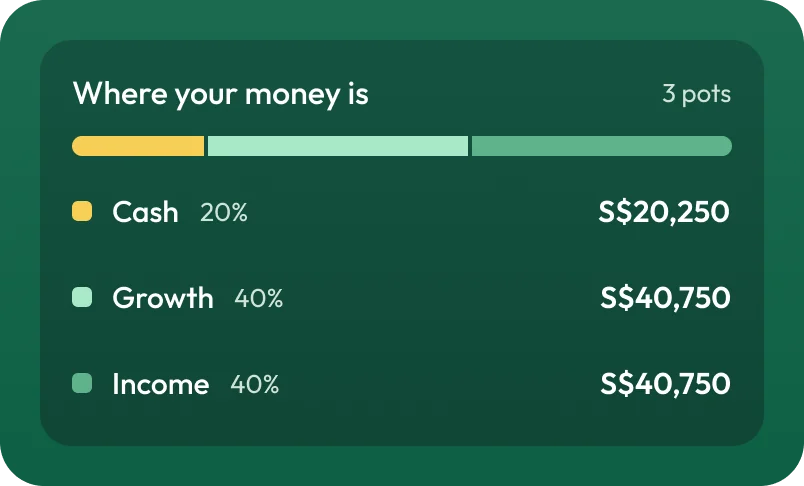 D
D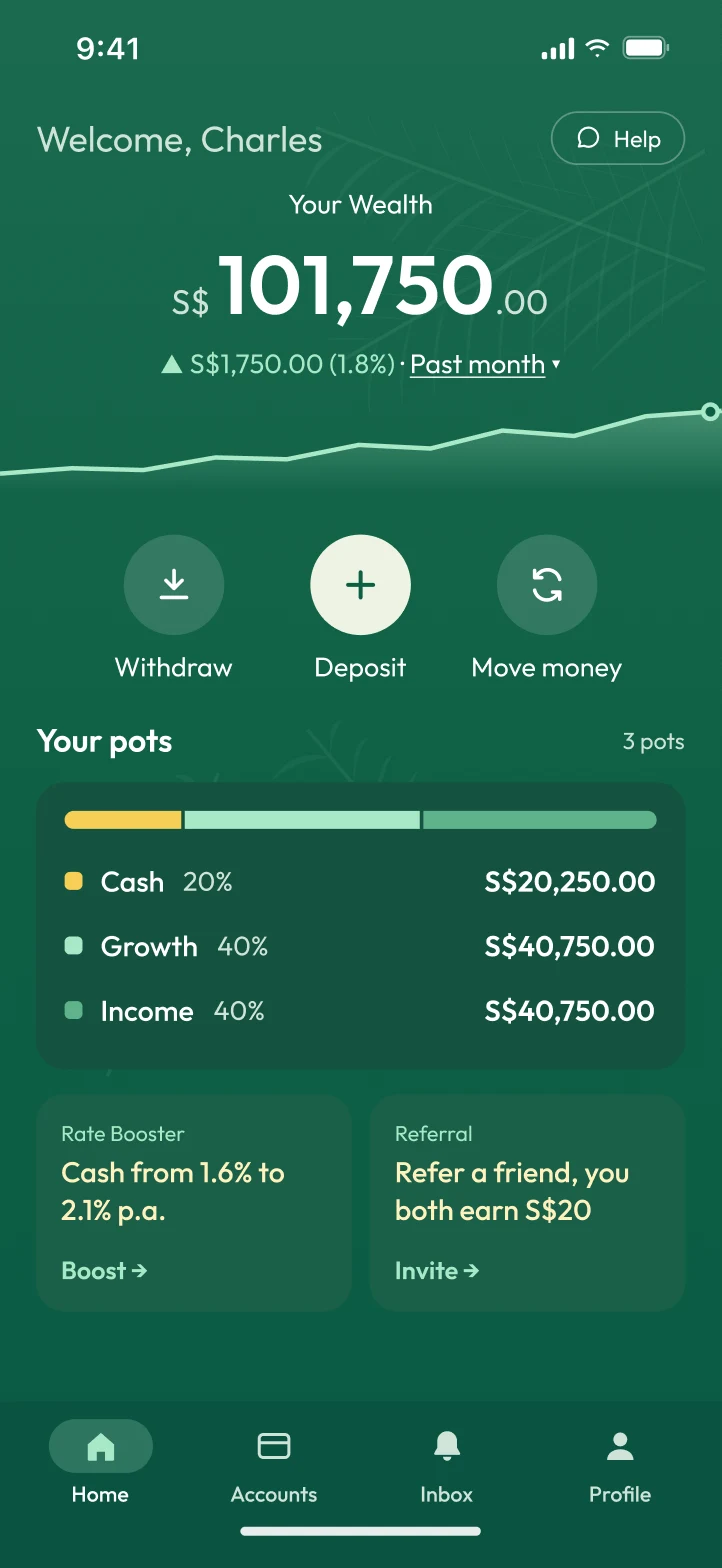
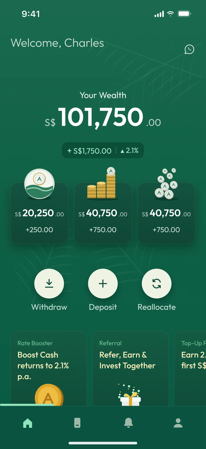
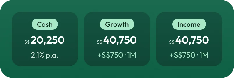
Wealth app · concept · two rounds · 2026
Arki Finance
The brief was “Redesign the home screen”. Five problems named, twenty references, options A to D for each, then the suggested combination built as a whole screen and tested. A second round started from those test results and changed the pick: the pots became an allocation bar.
25 references · 20 options · lowest contrast 3.5:1 → 4.9:1 · two synthetic test rounds
The file
---
name: design-process
description: Jordy's design process for redesigning or designing app screens
  with AI, from screenshots to a tested proposal and a portfolio case study.
  Use when Jordy asks to redesign, enhance or explore screens, compare
  options, set up a brand or variables for a design, or turn design work
  into a case study.
---

# Jordy's design process

AI drafts and explores. Jordy frames the problem, chooses, and owns the
result. Work in this order, and show each stage before moving on.

Before starting, check whether this is a first pass. If an earlier round
exists, follow Next passes instead of starting at stage 1.

## 1. Capture what exists

- Start from the real thing: App Store screenshots, the live product, or
  Jordy's Figma file. Put the originals on the canvas untouched.
- Rebuild one screen first and show it. Do the rest only after Jordy confirms.
- A rebuild is working material. Don't present it as an achievement.

## 2. Name the problems

- Write down the few real problems (usually 3–5), each as a short title
  plus one plain sentence on why it hurts the user.
- Check contrast and accessibility on the originals so the problems are
  facts, not opinions.
…
The top of SKILL.md, trimmed. It is written to Claude, so it talks about me in the third person.
Written after the CAMP redesign, where each of these stages was worked out by hand. Its first full run since added two habits: a synthetic check with AI personas before real people, and going round again until the design holds up.
Like my projects? Email me jordychew93@gmail.com or LinkedIn↗