Making a treasury app clearer, using AI to go from screenshots to a tested redesign.
Role
Product designer, working with Claude
Scope
7 screens: login, home, swap, invest and cards
Tools
Figma, Claude, Mobbin and Notion
Status
Independent concept, public material only
Home
Swap
Invest
Cards
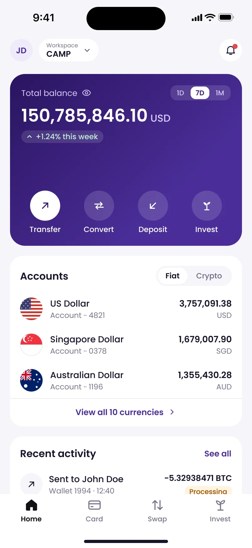
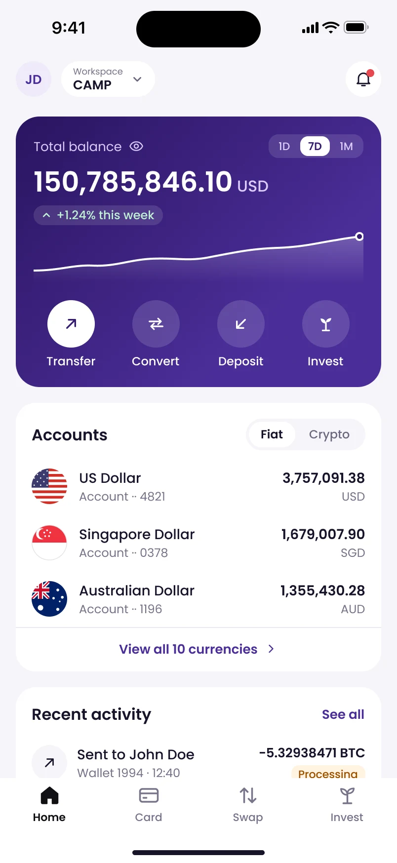
Actions moved next to the balance.
Transfer, convert, deposit and invest sit inside the balance card, with a 7-day trend for context.
The brief
CAMP lets finance teams pay, swap and invest millions in one app. Its screens made that harder than it should be.
I wanted to see how quickly I could get from the four problems below to a tested proposal, without cutting corners.
The problems
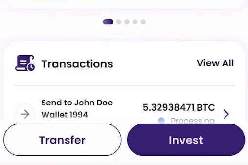
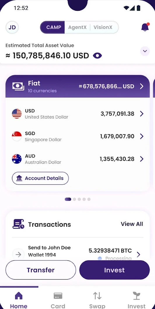
Floating buttons
Transfer and Invest floated over the balances and hid the list underneath.
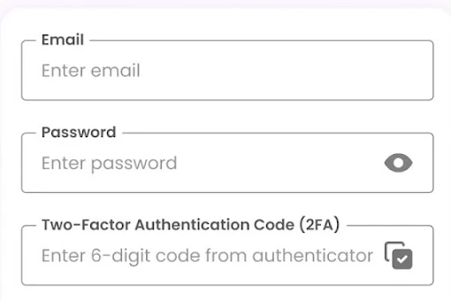
Crowded login
The 2FA code was squeezed into the same form as email and password.
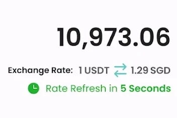
Loud countdown
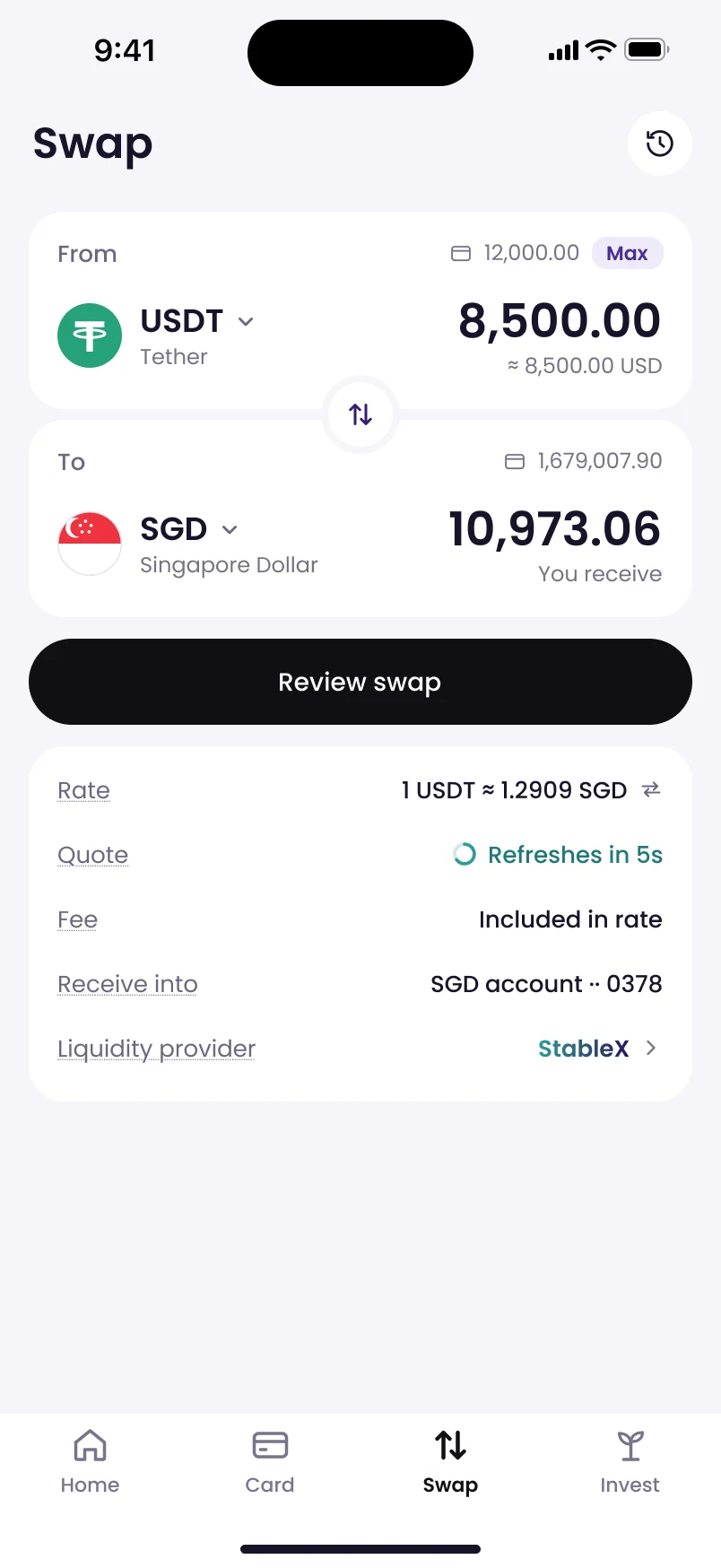
A green rate countdown competed with the amount being swapped.
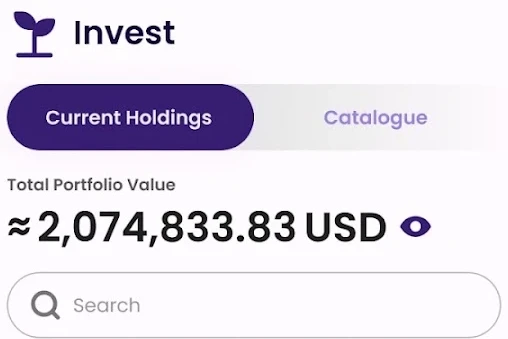
Faint text
Four text colours were too light to pass accessibility checks.
1Log in2FA on its own step
2Check balanceActions next to the money
3ConvertRate where pay meets receive
4ConfirmOne clear action, one accent
01 · One task, four steps
A full treasury task, from login to confirmation.
A finance lead logs in, checks their balance, converts USDT to SGD and confirms. At each step I used a pattern that Airwallex, Wise and Revolut Business share, picked out from twenty references.
Portfolio value
2,074,833.83 USD
+61.15 USD holding PnL
Portfolio value
2,074,833.83 USD
Treasury yield61%
Fixed income27%
Crypto yield12%
Portfolio value
2,074,833.83 USD
Treasury 61%Fixed 27%Crypto 12%
Chosen
Portfolio value
2,074,833.83 USD
Treasury yield61%
Fixed income27%
Crypto yield12%
02 · Explore wide, decide narrow
Four directions for one card, side by side.
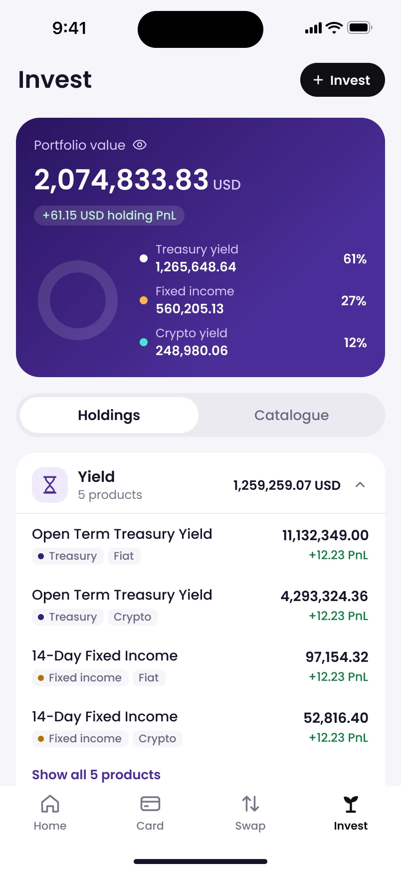
For the portfolio card alone I asked for four directions: a brand card, a donut, a trend line, and a mix of the first two. I chose the brand card with a donut because the split between yield, fixed income and crypto is what a treasury team checks first.
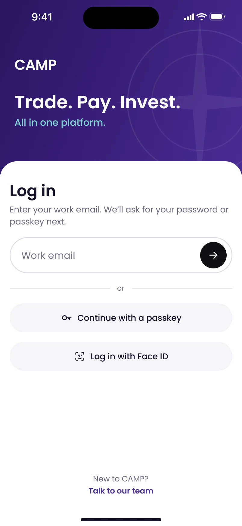
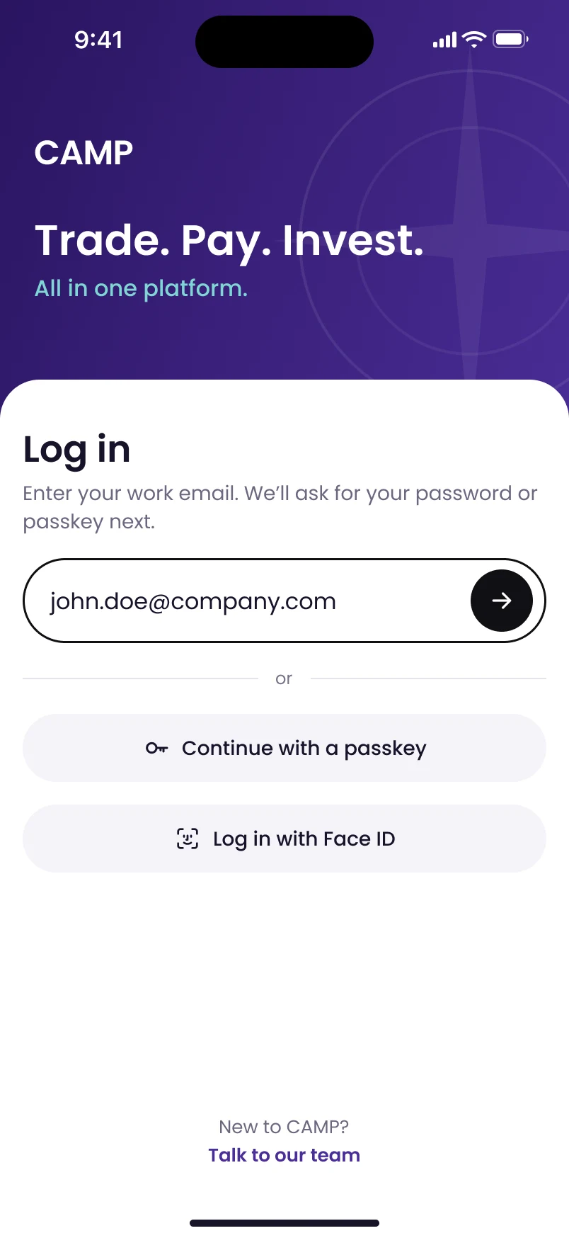
1EmailOne field, one arrow
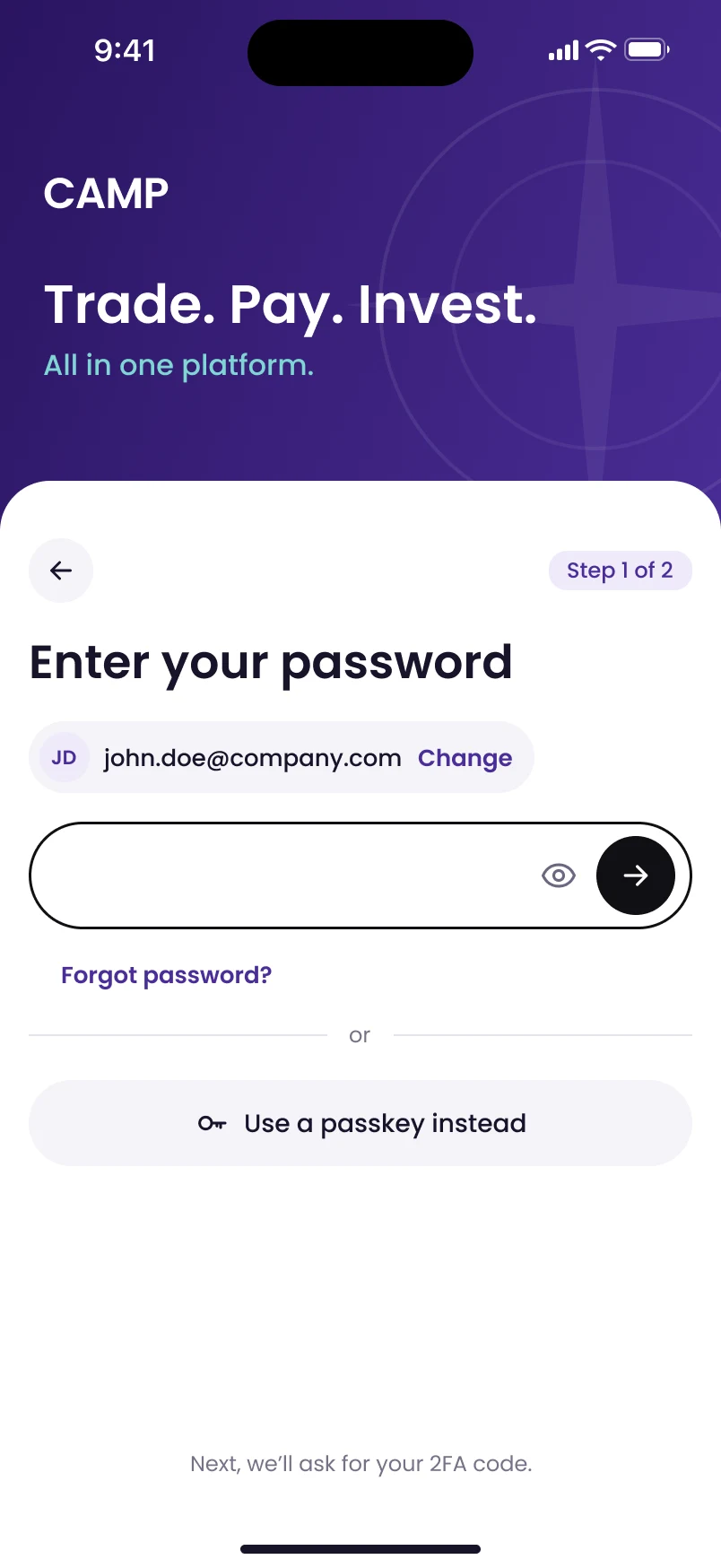
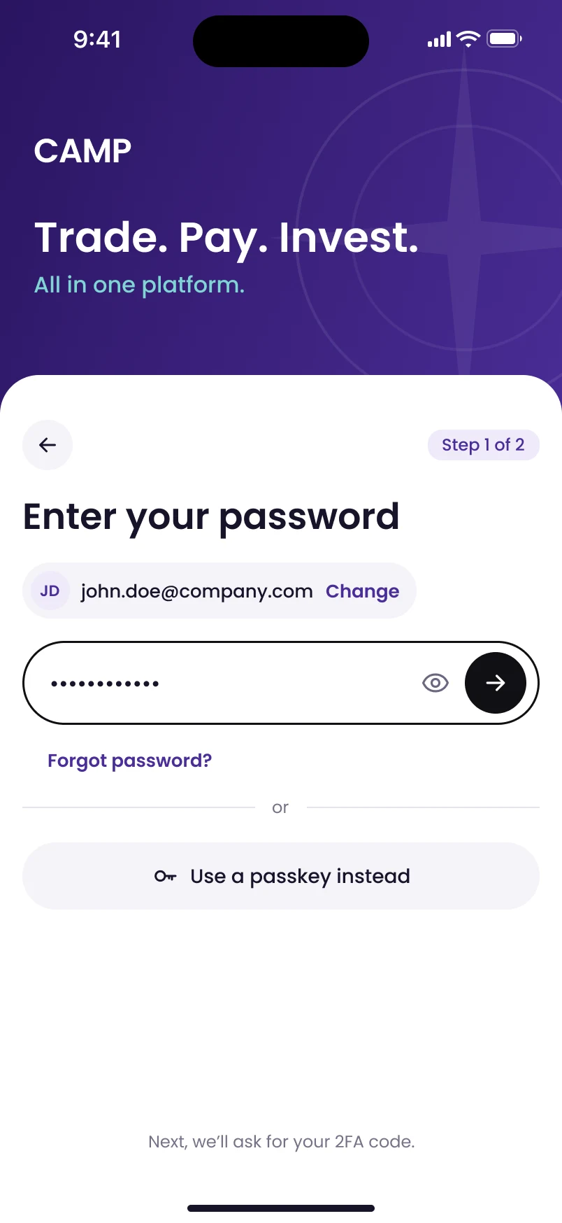
2PasswordOr a passkey instead
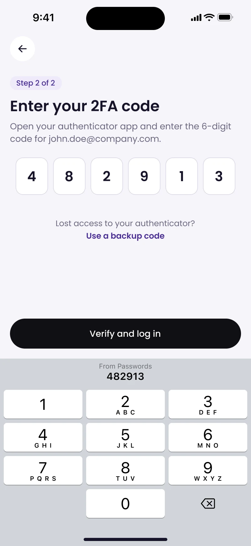
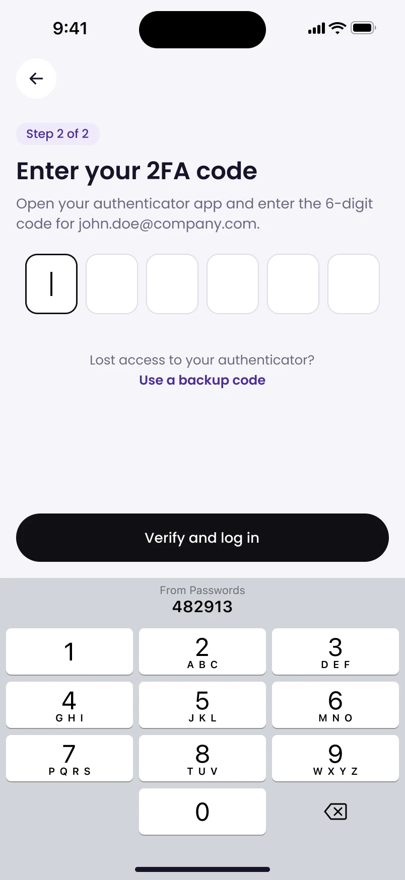
32FACode filled from the keyboard
03 · One thing at a time
Logging in is three short steps, with 2FA on its own screen.
Email first, then password, then a 2FA screen where the keyboard fills in the code. CAMP accounts are set up by the sales team, so there’s no sign-up competing for the screen.
Where it started
The original screens, with the four problems from the brief marked. Every change above answers one of them.
1Buttons float over balances
1
22FA squeezed into the login form
2
3Countdown competes with the amount
3
4Faint text fails contrast
4
In numbers
20
Screens from Airwallex, Wise, Revolut and others studied before designing
27
Options built and compared before each design decision
4 → 0
Text colours too faint to pass accessibility checks
72 min
From five App Store screenshots to a tested redesign
What I learned
AI made the making fast, so my time went into the parts that need judgement: framing the problem, choosing between options and checking the result.
 1
1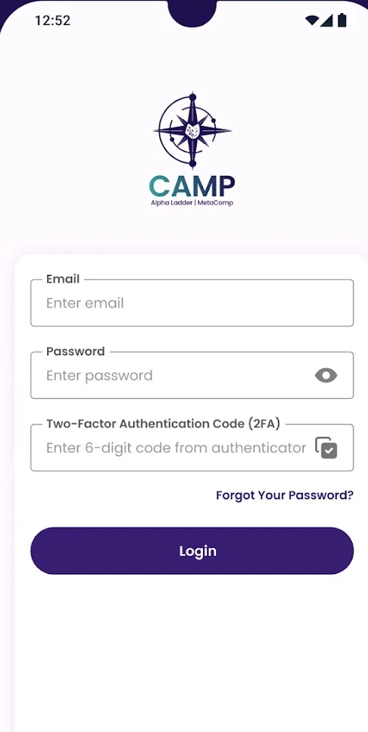 2
2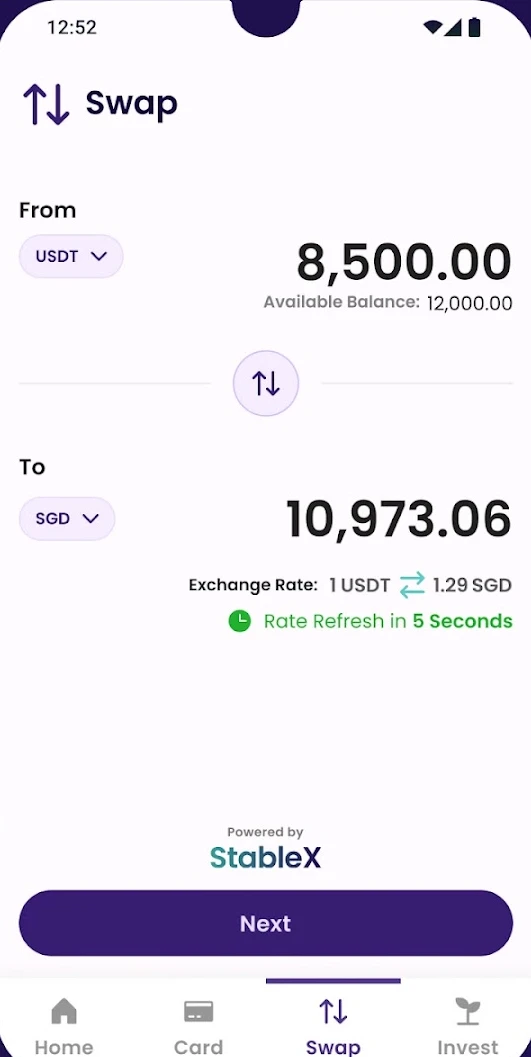 3
3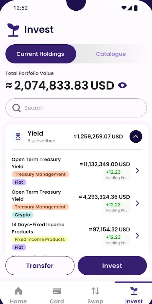 4
4