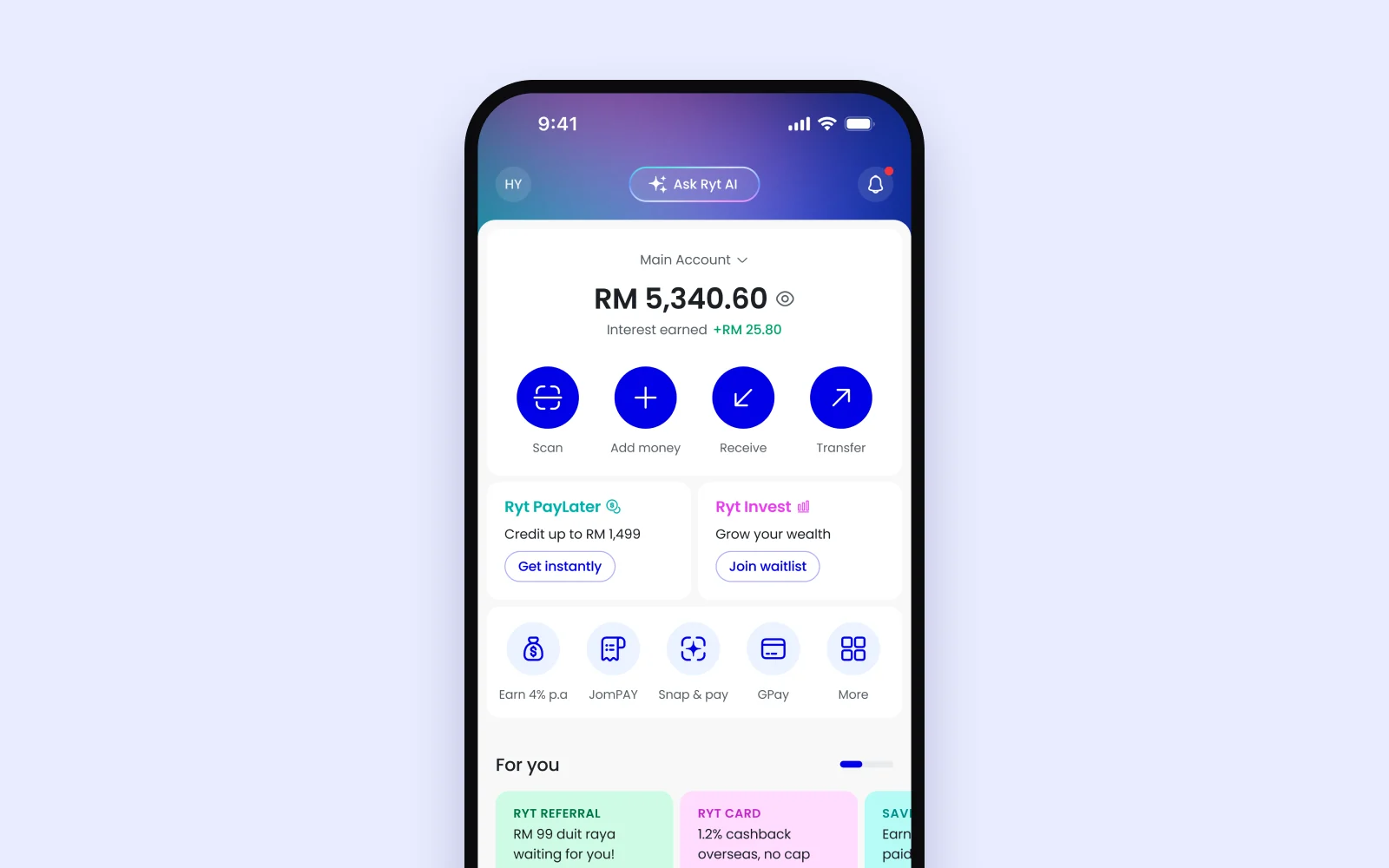
01 · Home screen
The approved limit sits on the home screen.
Showing the limit upfront made it feel like money that was already theirs, so people could start using it straight away.
Ryt Bank · 2025 · 2 min read
PayLater sat under the Financing tab. Eligible people had a limit waiting for them and no idea it was there.
Nobody wants another credit product to manage, so it had to feel like part of paying with Ryt.
01 · Home screen
Showing the limit upfront made it feel like money that was already theirs, so people could start using it straight away.
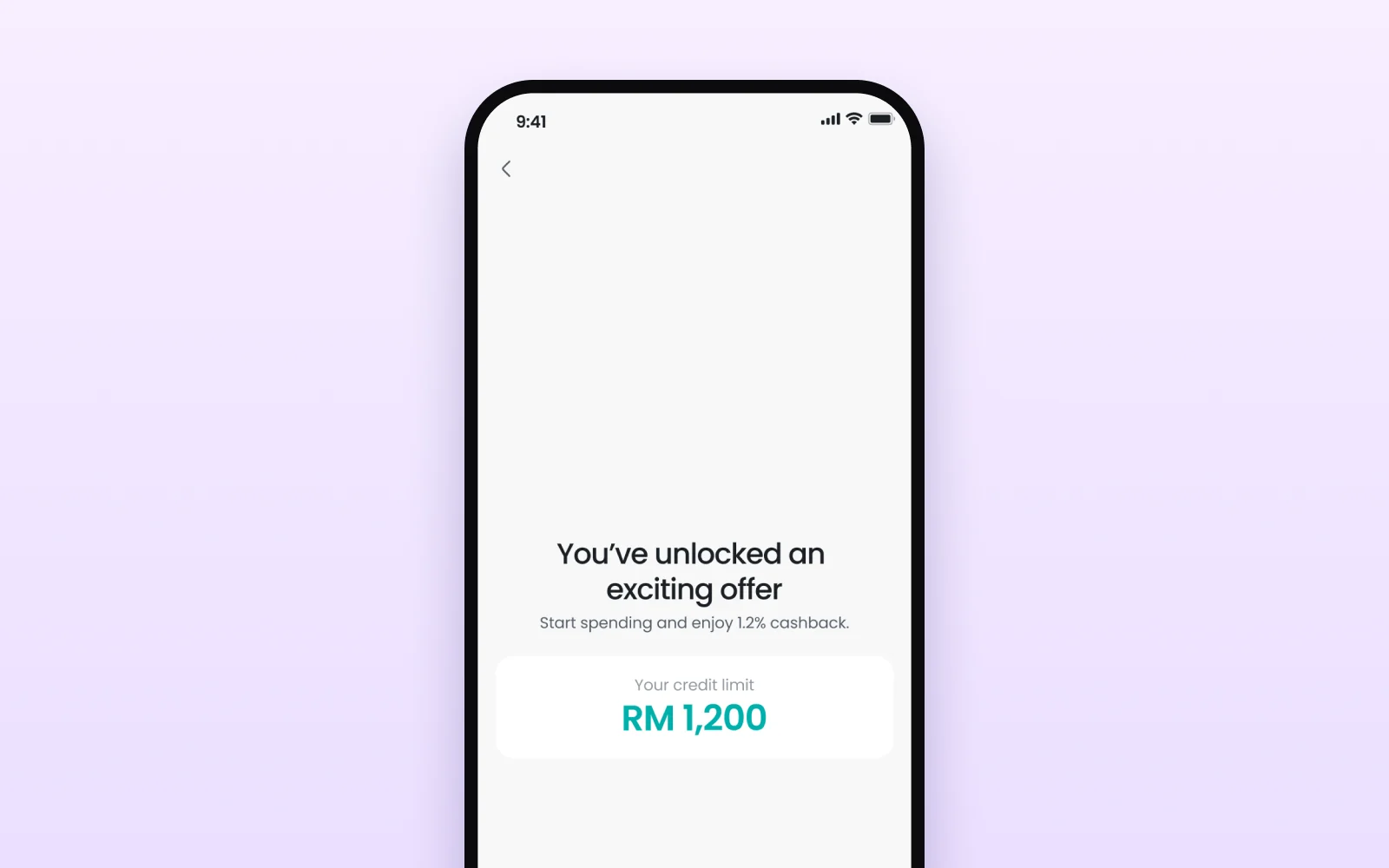
02 · Activation
With pre-approval, people claimed a limit instead of applying and hoping. Credit also becomes the default QR payment, so first use happens at the till.
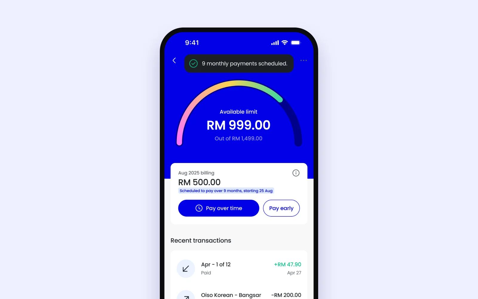
03 · Dashboard
The gauge shows what’s left at a glance. Pay over time sits right on the bill, and once you pick a plan, the dashboard confirms it.
“Ryt PayLater wins hands-down on the slicker experience.”
We launched without repayment reminders, and people who missed a payment had the roughest time. The activation flow worked, but it couldn’t make up for a rough repayment experience.
Like my projects? Email me jordychew93@gmail.com or LinkedIn↗