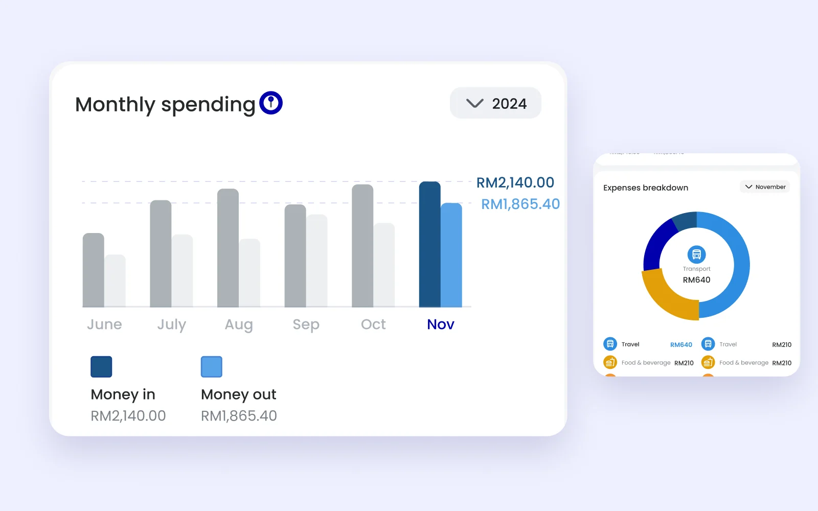
01 · Money in, money out
One chart for both directions.
Each month shows money in next to money out, with the current month in blue. The breakdown underneath splits the month’s spending by category.
Ryt Insights · 2024 · 2 min read
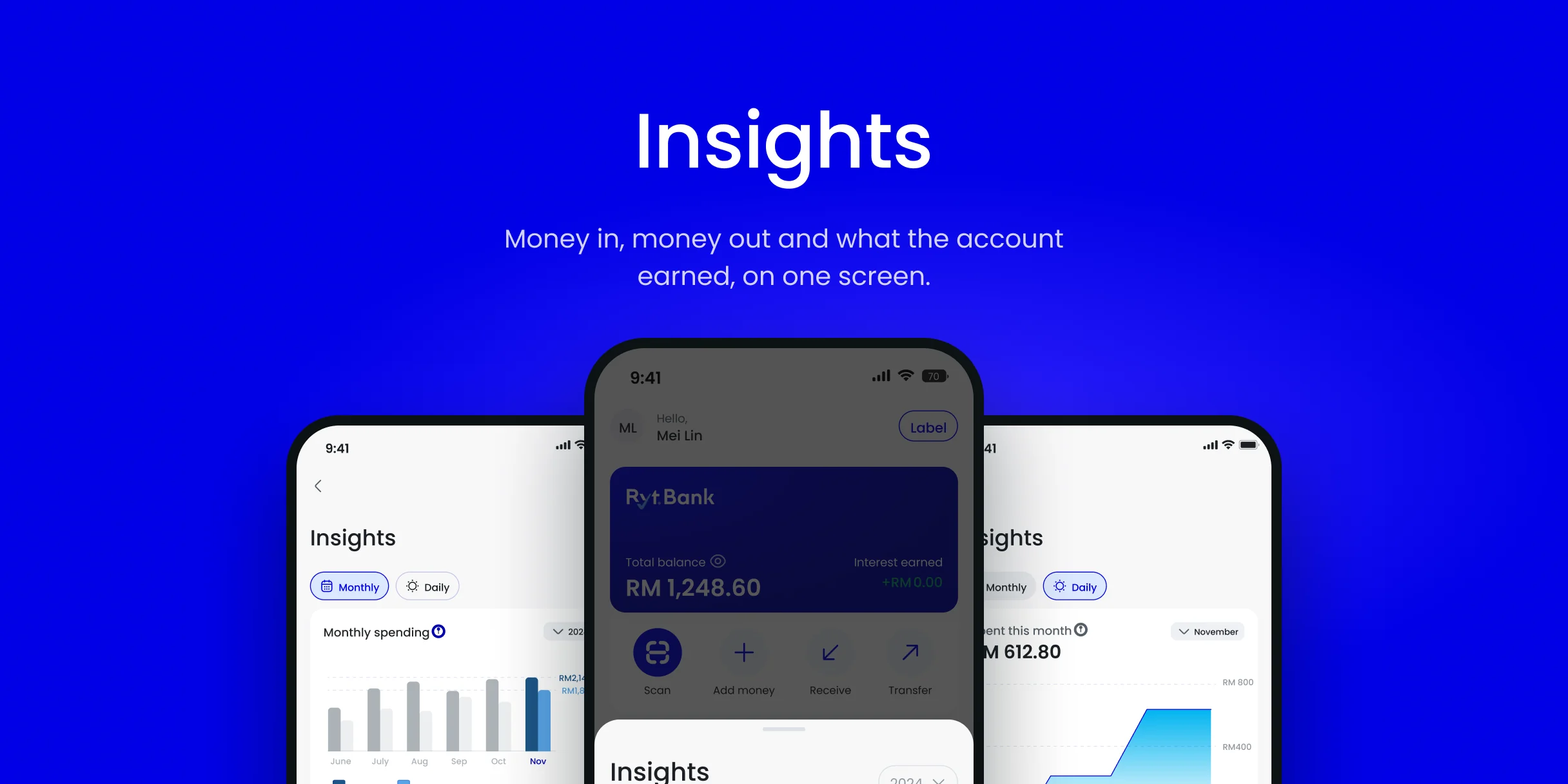
Early concept from 2024. The Insights in the Ryt Bank app today looks different.
A new bank’s customers could see their balance and their transactions, and nothing about where the money went.
The first concept had to answer three questions on one screen: what came in, what went out and what the account earned.
01 · Money in, money out
Each month shows money in next to money out, with the current month in blue. The breakdown underneath splits the month’s spending by category.
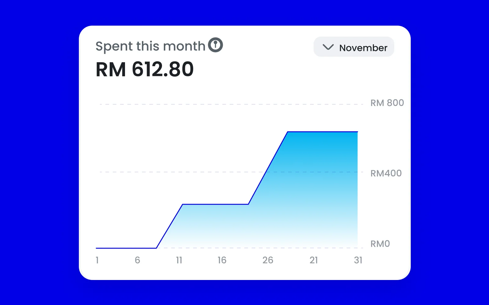
02 · Daily spending
Switching to daily turns the bars into a running total, so one big spend shows as a step and a quiet week stays flat.
 +RM••••+RM2,140.00
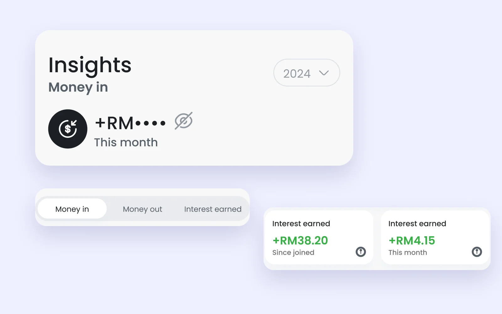
03 · Interest earned, and privacy
A small number that feels good to see, on the dashboard sheet. Amounts hide with one tap, for anyone who checks the app in public.
This concept was replaced before launch, and the version in the app today is simpler. The question it was built around stayed the same: where did the money go?
Like my projects? Email me jordychew93@gmail.com or LinkedIn↗