A wealth app’s home screen that answers three questions at a glance, from mockup to tested redesign.
Role
Product designer, working with Claude
Scope
Home screen, two rounds of options and testing
Tools
Figma, Claude, Mobbin and Notion
Status
Independent concept, public material only
Pots
Period
Move money
Offers
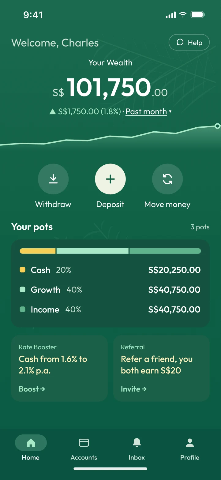
Your money, split at a glance.
One bar shows how much sits in Cash, Growth and Income, with each pot’s share and balance underneath.
The brief
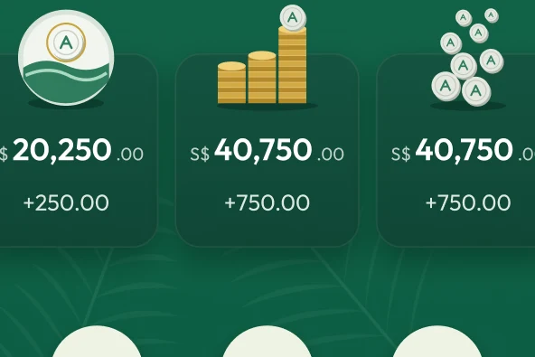
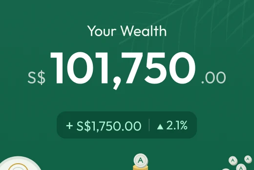
Arki’s home screen showed someone’s wealth in Singapore dollars. It didn’t say which money was cash, what was invested, or over what period it had grown.
I wanted to see how quickly one shared mockup could become a tested proposal, using the same process as my CAMP redesign.
The problems
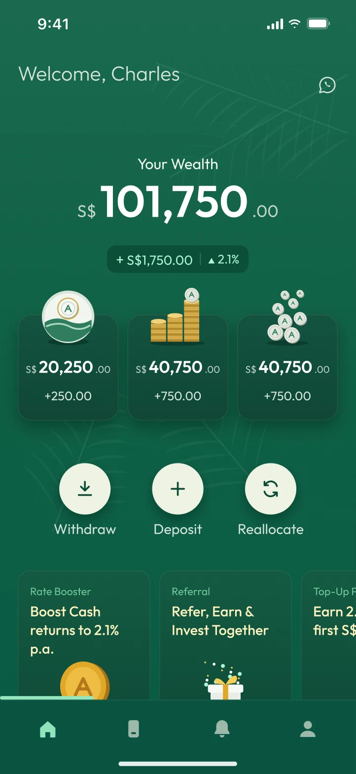
Unlabelled pots
Three cards showed a picture and a balance, but not which money was cash and which was invested.
Gain with no timeframe
“+S$1,750 ▲ 2.1%” didn’t say since when, so it couldn’t be trusted or compared.
Icons without labels
Four tabs and a WhatsApp button had no words, so finding support was guesswork.
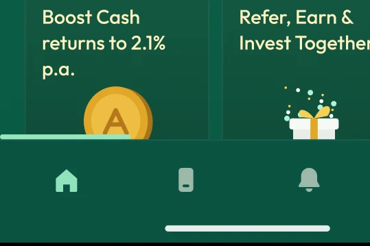
Offers under the nav
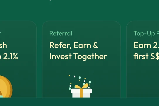
The promos started below the fold, the tab bar covered them, and one was cut mid-word.
1How much is cash?A split you can see
2Up since when?The period, in words
3Who do I ask?A Help button that says so
01 · One look, three answers
Know where your money is, how it’s doing, and who to ask, at a glance.
Each answer now sits in plain words on the home screen. They use patterns that Wise, Monarch and Lightyear share, picked out from twenty-five references: a split you can see, a period on every gain, and labels on every icon.
A Named cards
CashS$20,2501.6% p.a.
GrowthS$40,750+S$750 · 1M
IncomeS$40,750+S$750 · 1M
B Account rows
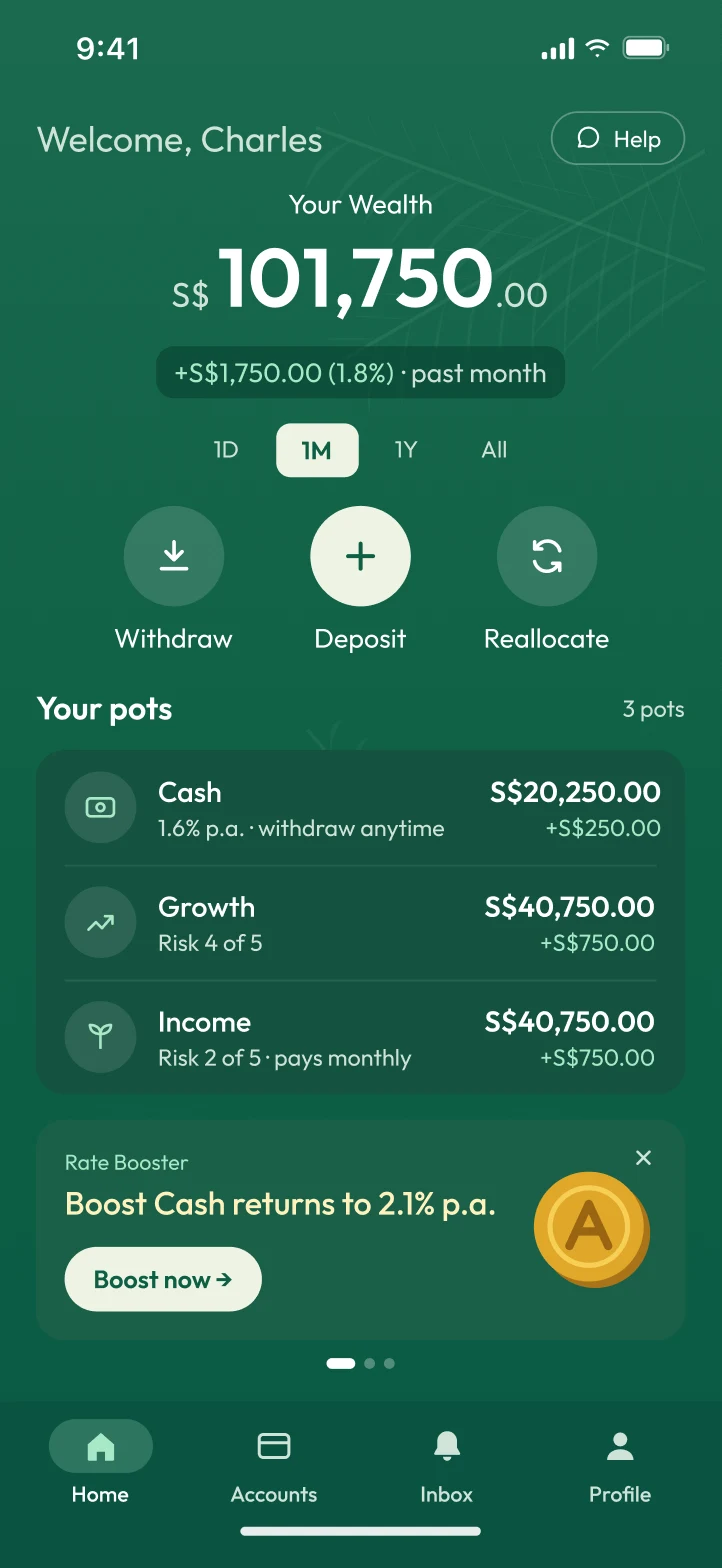
Cash1.6% p.a. · withdraw anytime
S$20,250+S$250
GrowthRisk 4 of 5
S$40,750+S$750
IncomePays monthly
S$40,750+S$750
C Swipe cards with trend
CashS$20,250▲ 1.2% · 1M
GrowthS$40,750▲ 1.9% · 1M
IncomeS$40,750▲ 1.9% · 1M
D Allocation barChosen
Cash20%
Growth40%
Income40%
02 · Explore wide, decide narrow
Four ways to show the pots, and why I chose the bar.
Named cards, account rows, swipe cards with a trend, and an allocation bar. I chose the bar: it answers “how much is cash, how much is invested” in one look, and it sets up the action people use most, moving money between pots.
0OriginalPots as pictures, no names
1Round 1Named rows, a period on the gain
2Round 2The split, and Move money
03 · Two rounds, then real people
Two rounds of synthetic testing, and what’s still unresolved.
After each round, five AI personas tried the old and new screens blind. Each round fixed what the last one found, and the second round also caught something the new design made worse.
Where it started
The original home, redrawn from Arki’s published mockup at the same size, with the problems marked. Every change above answers one of them.
1Pots with pictures, not names
2A gain with no period
3Faint text fails contrast
4Icons without labels
5Offers under the nav
12345
Synthetic test results
A synthetic test with AI personas, not user research.
Five personas, blind, each round
Before
After
Round 1 · original vs v2, tasks fully understood
0 of 25
18 of 25
Round 2 · v2 vs v4, tasks fully understood
11 of 30
21 of 30
Moving money between pots
0 of 5
5 of 5
Finding this year’s earnings
1 of 5
0 of 5
Average confidence, out of 5
3.3
4.0
Each round, five personas (a cautious retiree, a busy parent, a hands-on investor, a user with low vision, and a business owner) tried both screens without knowing which was new. AI personas are more patient than people and lean towards familiar patterns, so these numbers point at problems; they don’t prove a design works.
Not done yet
Round two found a regression: moving the period into the change line made “this year” harder to find.
That’s four issues still raised by more than one persona, so I wouldn’t ship v4 as it stands. Here’s what I’d change before a third and final synthetic round, and then five real users.
Make the period a control you can see.An outlined “Past month ▾” pill that lists This year (YTD) by name, or the chips back with YTD added. All five personas missed it.
Give each pot its own change back.A small gain under each balance in the legend, so the split doesn’t cost the detail people check.
Date the chart.A start date and “Today” at either end, so the line reads as data.
Say what the boost costs.A terms line under the offer, and the “Boost” and “Invite” links as real buttons that are easier to see.
In numbers
25
Screens from Wise, Monarch, Lightyear and others studied before designing
20
Options built and compared across two rounds
4.9:1
Lowest text contrast, up from 3.5:1 and past the 4.5:1 accessibility minimum
2
Rounds of synthetic testing with five AI personas each
What I learned
The synthetic test caught two problems: a return that didn’t add up in round one, and in round two a regression I had designed in myself by hiding the period to free up space. It doesn’t replace people, but it means the hour with real users goes to the hard questions.